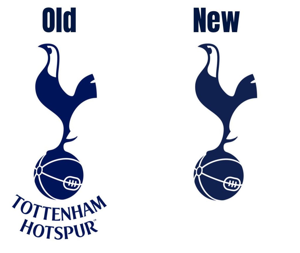
Why Tottenham have now decided to change their club badge
Tottenham Hotspur have introduced a redesigned badge that subtly updates the logo fans have cherished for decades.
Over the years, the club’s emblem has evolved multiple times, but the iconic cockerel perched atop a football has remained a timeless symbol of Spurs. Supporters will be relieved to see that this emblematic bird remains central to the design, retaining its prominent position on the football.
However, one notable detail has been removed to streamline the crest’s appearance. Since 2006, the words “Tottenham Hotspur” curved beneath the logo, but these have now been omitted in the updated design.
The change was confirmed on social media by Fabrizio Romano, with Tottenham providing an explanation for the redesign. The club stated that removing the text allows for a more versatile and scalable design across various digital and physical formats.
According to their announcement, this refinement is part of a broader initiative to elevate the cockerel as a standalone icon representing the club. The official statement read, “We have removed the curved Tottenham Hotspur text from beneath the cockerel. This enables us to increase its scale across different environments and stand proud as a true icon for the club.”
This badge update aligns with Tottenham’s efforts to rebrand itself in the digital era. The club’s website elaborated on the additional changes accompanying the new crest, emphasizing the club’s commitment to maintaining a connection to its heritage while modernizing its visual identity.

The updated branding also introduces a silhouette version of the cockerel, the reintroduction of the “THFC” monogram, and fresh colors, patterns, and hallmarks inspired by Tottenham’s storied history.
While the adjustments to the crest are subtle, they reflect a broader trend among Premier League clubs striving for modernity and marketability in the digital landscape.
Liverpool, for example, unveiled a revised badge ahead of the 2024/25 season, aiming to enhance their global appeal to online audiences. Compared to Liverpool’s redesign, Tottenham’s changes are more restrained, ensuring the fundamental elements of the crest remain intact. This approach minimizes potential backlash from fans, as the essential identity of the badge remains unchanged.

Tottenham has long positioned itself as a pioneer in the modernization of club branding. The club first took significant steps in 2006, when it simplified the badge to focus on the iconic cockerel.
This minimalistic and bold design choice set a precedent that other clubs have since followed. As the official website states, “A Club of firsts, Tottenham Hotspur took an unprecedented step in 2006 to modernize its identity by simplifying the badge around its world-famous cockerel, that has since stood alone in minimalistic, iconic fashion and which other clubs are now doing.”
The decision to modernize the badge reflects Tottenham’s awareness of the evolving demands of branding in football, particularly in an era where digital visibility and adaptability play a crucial role in a club’s global reach.
By refining the crest to emphasize its iconic simplicity, Spurs aim to strengthen their identity while ensuring the logo remains versatile across platforms. The move also reinforces the club’s commitment to maintaining a balance between tradition and innovation, preserving the legacy of the cockerel while adapting to the future.
This redesign marks another chapter in Tottenham’s ongoing efforts to enhance its global presence. By focusing on a cleaner and more iconic emblem, the club aims to solidify its reputation as a forward-thinking organization that respects its history.
The updated badge, along with other branding elements, signals a new era for Tottenham, one that embraces modernity while staying true to the core symbols that define the club’s heritage.
Read Also: ange postecoglou tottenham hotspur
Read Also: tottenham-midfielder-james-maddison

